TOPMAX — Brand Identity & Campaign System
TOPMAX is an electronics marketplace built for people who want everything, fast and without compromise. The brief was simple in theory: take a business founded by people who know their products inside out, and give it a brand culture that actually speaks to a younger, maximalist generation.
The existing direction was functional but flat. No personality, no tension, no reason to care. So the work started from scratch on the cultural layer: who is this brand for, how does it move, what does it say when no one’s looking?
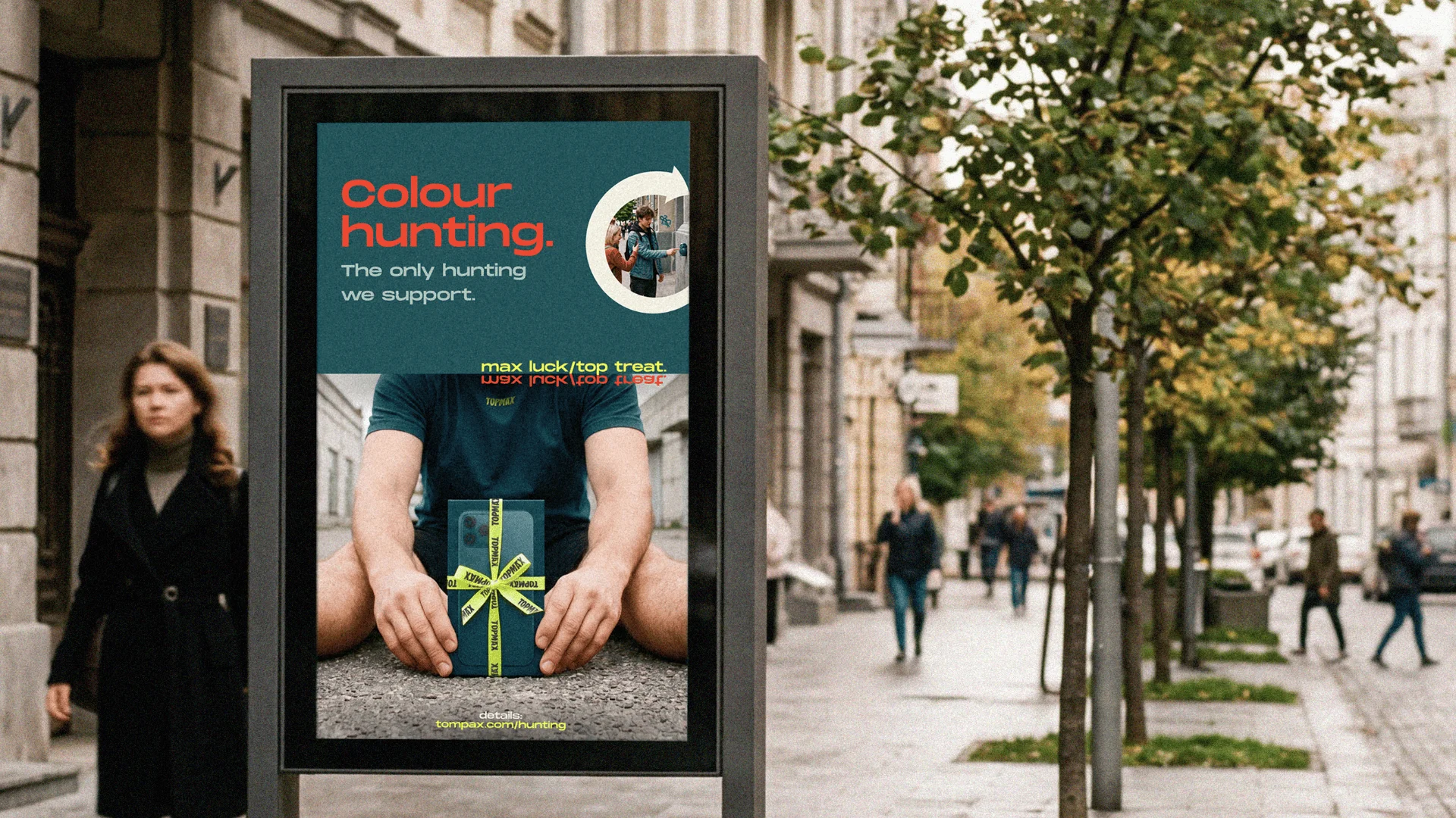
The answer turned out to be a meta-ironic one. Everyone performs minimalism. Capsule wardrobes, clean aesthetics, “less but better.” And yet the tabs are still open, the cart is still full, and the delivery notification is still the best part of the day. TOPMAX doesn’t pretend otherwise. It leans in.
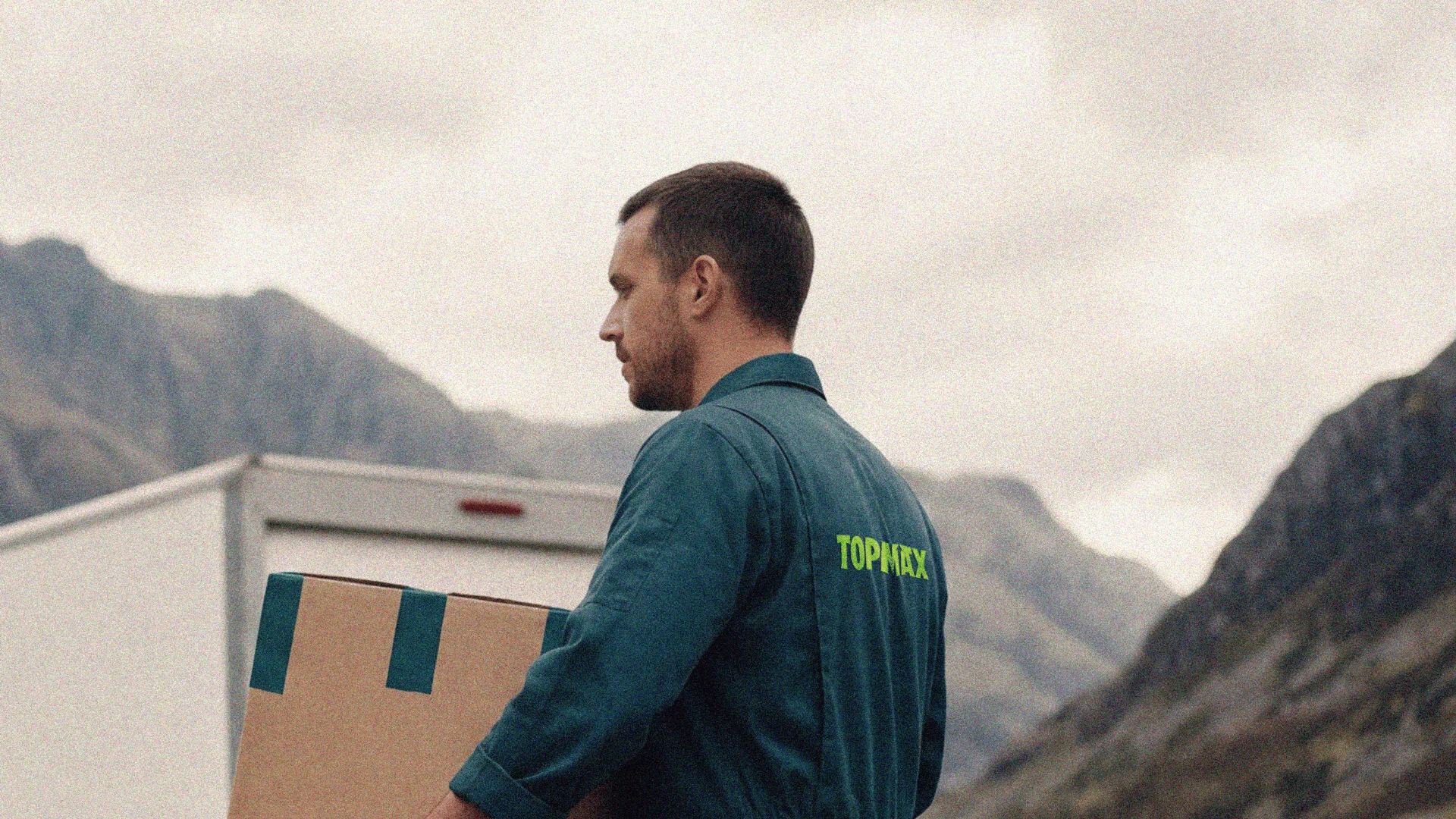
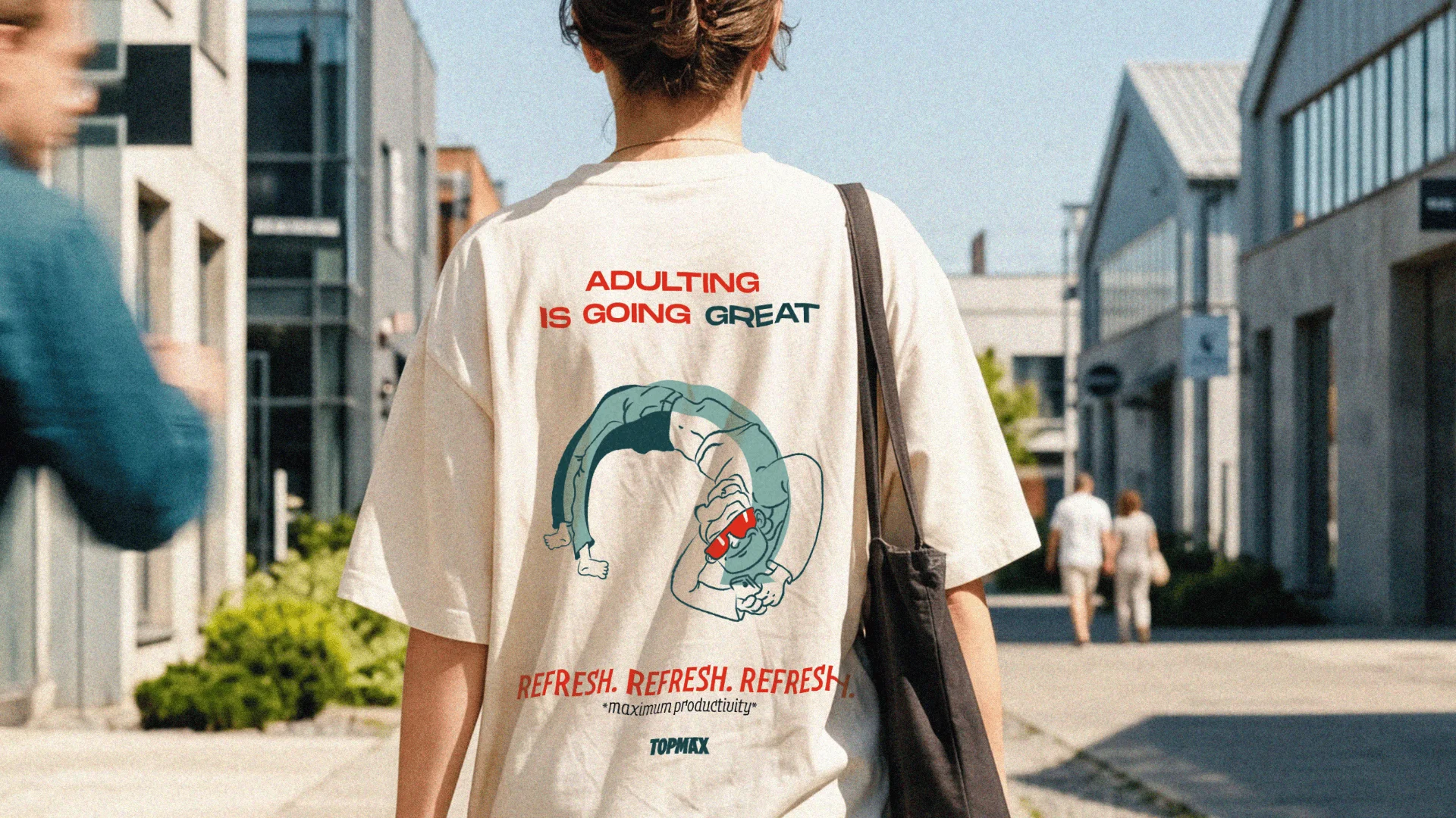
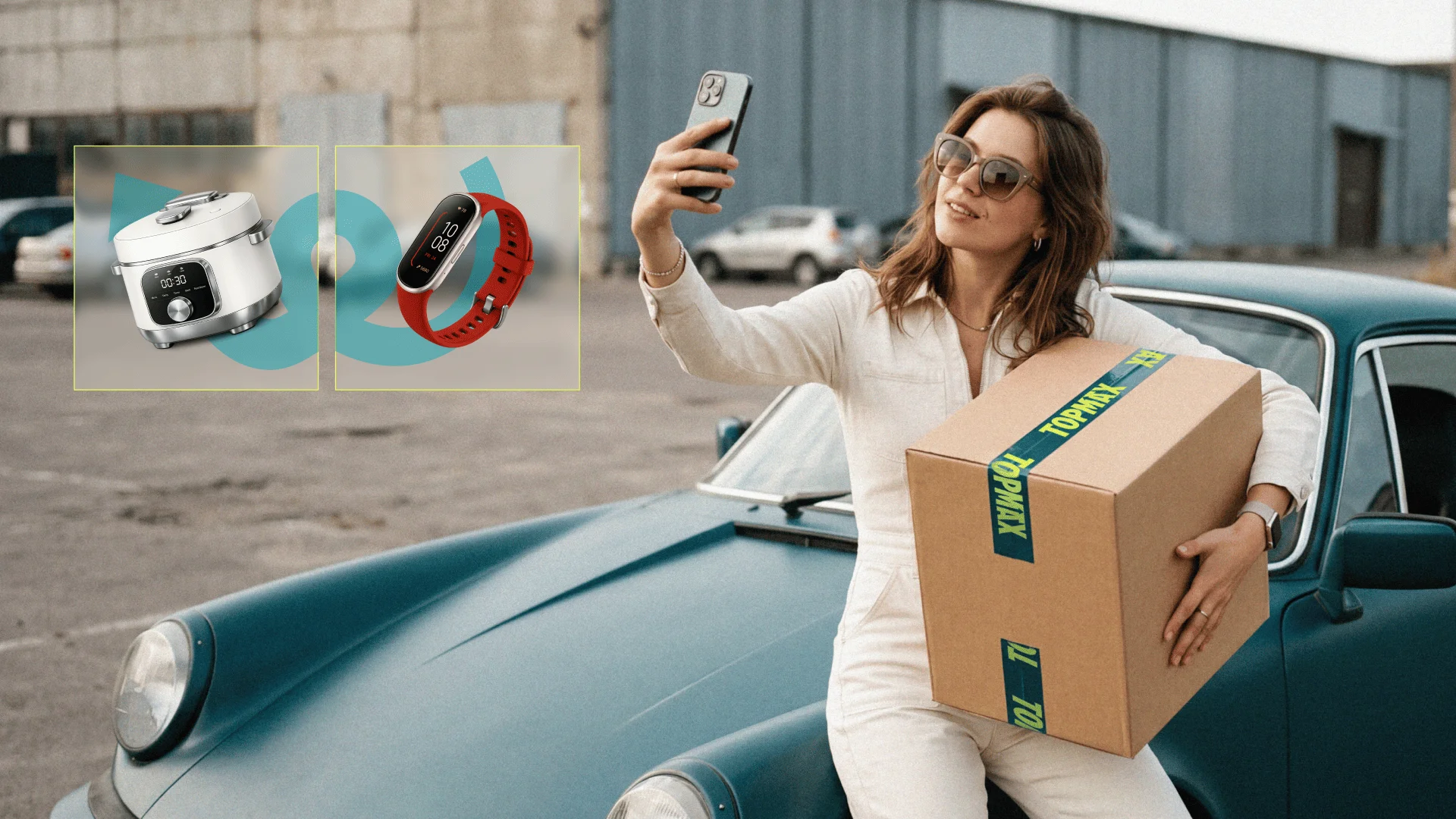
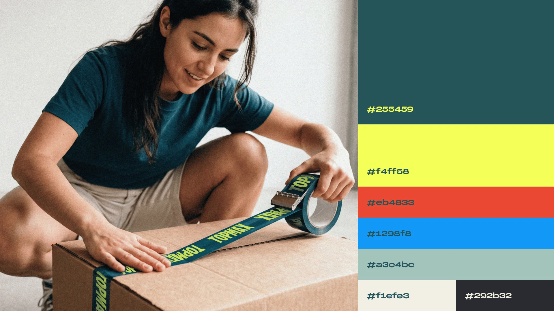
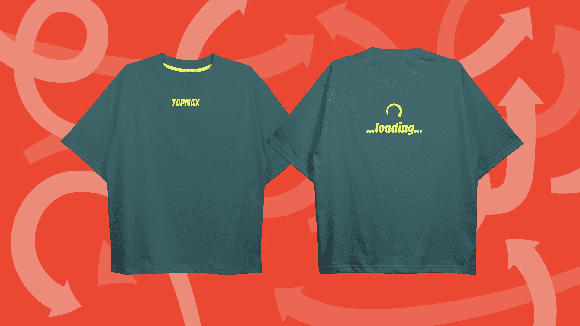
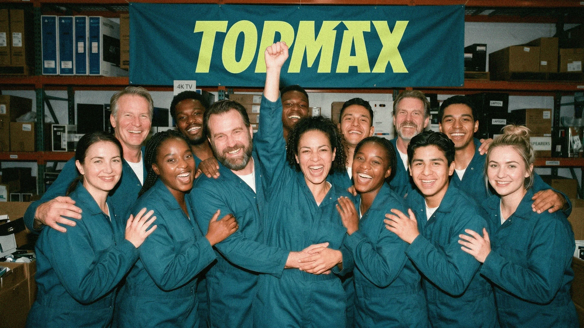
The result is a system built around the idea that maximum is the minimum. Deep teal, yellow-green, cream, and a cast of supporting colours that stretch across OOH, merch, packaging, and campaign photography without losing coherence. The mascot is a goofy guy perpetually mid-refresh, arcing through the air in a circular loop. Relatable, slightly unhinged, genuinely fun.
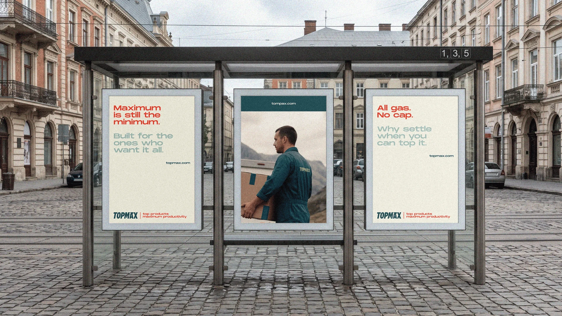
The campaign language leans into the contradiction of modern productivity: Adulting is going great. Refresh. Refresh. Refresh. The visual system covers brand identity, typography hierarchy, colour palette, AI-assisted campaign photography direction, illustration, merch concepts, OOH mockups, and packaging.
TOPMAX is currently in the process of legal registration. This case study reflects the brand identity and campaign concept developed ahead of launch.
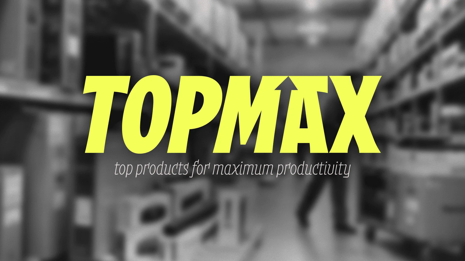
The logotype is set in Musikal by Fred Wiltshire / FredsFonts, licensed via Future Fonts. Commercial licensing to be confirmed upon brand launch.